Case study

Alchemer Dashboard

ClientAlchemer
RoleUX Researcher, Designer
TeamLead Designer
Phases
ResearchWireframingVisual DesignPrototypingUsability TestingHandoff / Dev

The Concept

If everyone’s data is special, how can we help people standardize it for presentation?

Alchemer’s partner strategy for our dashboard product presented unique challenges for our survey-driven users. Where other datasets are regular and predictable, survey data is anything but — meaning that our software needed to fill the gaps and help users prep their data for presentation.
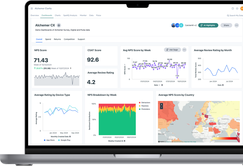
Alchemer Clarity dashboard on a MacBook Pro — NPS, CSAT and review-rating charts
Alchemer Clarity
The dashboard shown is ThoughtSpot, our partner product — not my design.

The Problem

Dashboards rely on predictable, structured data. Custom surveys are anything but.

Alchemer’s partner strategy for this product presented many challenges. Bridge the gap between two applications, make everything feel cohesive, and build new tooling to clean and prep data without adding too much scope.

If users hadn’t prepped their data, the partner product was nearly unusable. We needed low-effort, high-impact nudges, contextual education, and usability testing.

From Surveys to Dashboards
Users design their survey, collect responses, then need to get that data into charts on a dashboard. Our work lived in the “prep” gap.
Build step wireframeBuild
Collect step wireframeCollect
Prep step wireframePrep
Visualize step wireframeVisualize
Monitor step wireframeMonitor
No labels
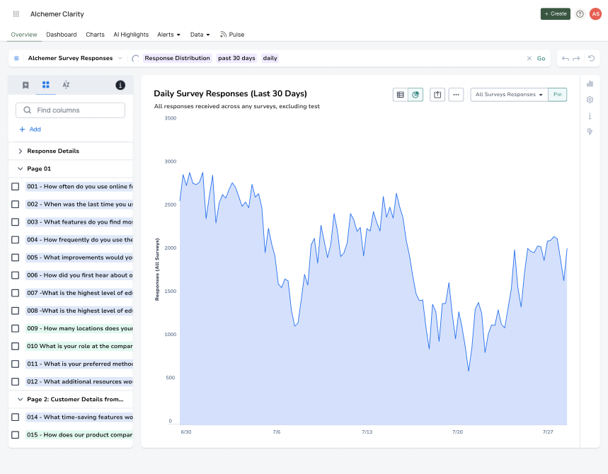
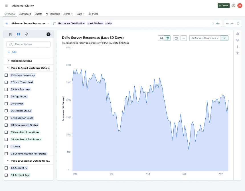
The chart builder’s sidebar just wasn’t built for survey data, with its full-sentence questions and differentiating information at the end of the question.
Shorthand labels
To get users to something more usable, we needed inline labelling, and tools for prepping data that existed, but were scattered across areas of the application.
clarity.alchemer.com
Chart builder sidebar with full-sentence question names truncated mid-wordChart builder sidebar with concise shorthand labels like 01 Usage Frequency
Full sentence questions are too long…
Shorthand labels fit

The Process

Users told us over and over that the main reason they’d switch to our tool is if it saved them time.

While multiple methods of gathering feedback gave us confidence we were meeting real user needs, a consistent theme from my research was that users expected our version of a dashboard to require less work than exporting to an external tool — and with good reason.

01Product ResearchAsked users about their needs and feature wishlist for a dashboard product.
02Concept TestingShowed concept mockups and asked users to compare options and share feedback.
03Usability TestingTested high-fidelity prototypes to evaluate navigation, names, and onboarding flows.
04Field TestingUsed analytics data to tweak and improve onboarding flows in-flight after the product launched.
Real customer quotes from research interviews

“We spend a lot of time downloading, cleaning, and re-uploading the data into PowerBI currently. It would be so nice not to have to do that part.”

— Head of Customer Experience, Resort chain

“We’ve put a lot of work into our existing Domo dashboards. This would have to be super quick to set up.”

— Employee Experience Manager, Global payment company
so…

The Outcome

Intervention
01Label while building

We made data prep a part of survey building, saving users time later on.

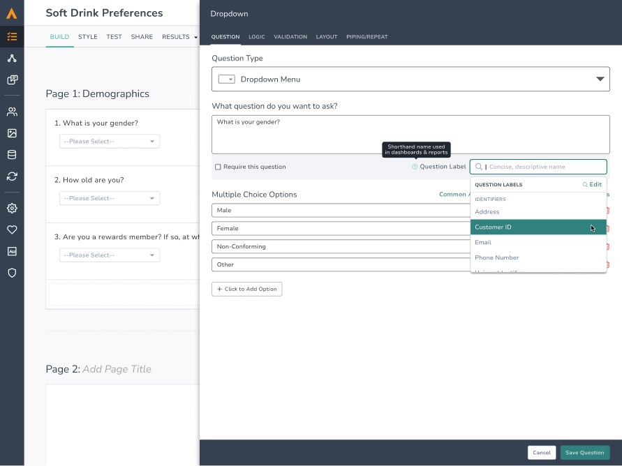
We made question labeling a prominent feature with descriptive help text. This meant survey data was partly prepped before a dataset is created, making the prep step seem shorter.
app.alchemer.com
Survey builder question editor with the Question Label field and suggestion dropdown
Label while building
Question labels sit right in the survey builder — “shorthand name used in dashboards & reports” — with suggestions from the org’s library.

We also added more robust features for managing the list of labels, allowing teams to use consistent labels across their surveys. When data is pulled into the dashboard, questions with the same label can be merged effortlessly.
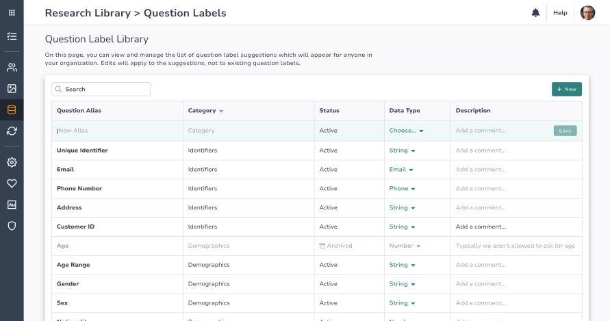
Question label library
Teams manage a shared list of label suggestions — categories, data types, and comments — for everyone in their organization.
app.alchemer.com
Question Label Library — managing label suggestions for the whole organization
Intervention
02Prep & clean using existing tools

We made a data preparation hub which linked to existing tools.

In order to deliver value more quickly, I designed a simple hub that directed users to existing tools for data preparation. This flow sets a simpler groundwork for more integrated tooling to be added later.

This design also highlights fast-follow functionality to allow multiple surveys to be combined based on shared labels, avoiding the need for more complex merge workflows & interfaces.
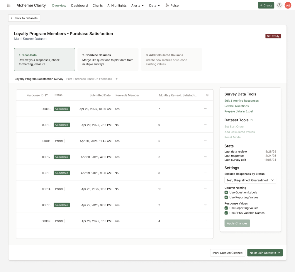
The data preparation hub
Clean → Combine → Calculate: each step reviews the data and links out to tools that already existed elsewhere in the application.
clarity.alchemer.com
Data preparation hub — Clean Data, Combine Columns, Add Calculated Columns steps over the response table

The Outcome

A few months after launch, customers were adopting a product that many said would be a lot of effort to move to from existing solutions.

0Unique users
0Unique customers
0%Adoption rate
$0KIn deals that depended on Dashboard
40%30%20%10%0%Month 1Month 2Month 3Month 4Month 537%
Adoption rate
First five months after launch.

Related Case Studies

Thanks for reading. No landmines were harmed…

Phil RauAlchemer Dashboard — Alchemer, 2025
Alchemer Dashboard — Phil Rau